Skyward Bound: Satellite Data Infographic
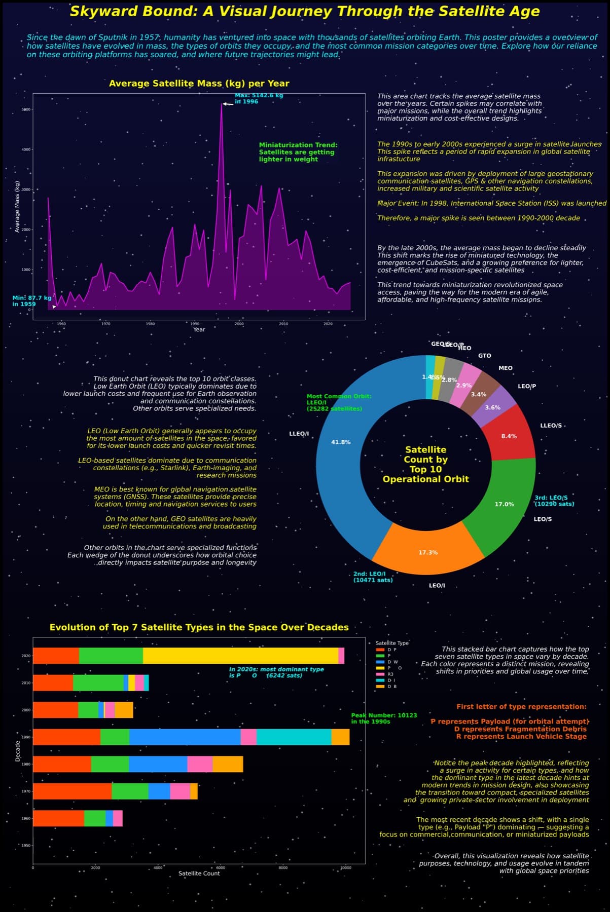
The dataset was cleaned and processed to examine changes in satellite mass, operational orbit, and mission type across multiple decades, then presented as a single infographic poster.
Role and Contribution
Data visualization project owner responsible for cleaning the dataset, extracting analysis features, building dashboard views, and composing the final infographic.
Problem and Context
Satellite history is difficult to understand from raw tabular records alone. This project uses approximately 63,000 satellite records to explain changes in satellite mass, operational orbit, and mission type across multiple decades.
Solution Overview
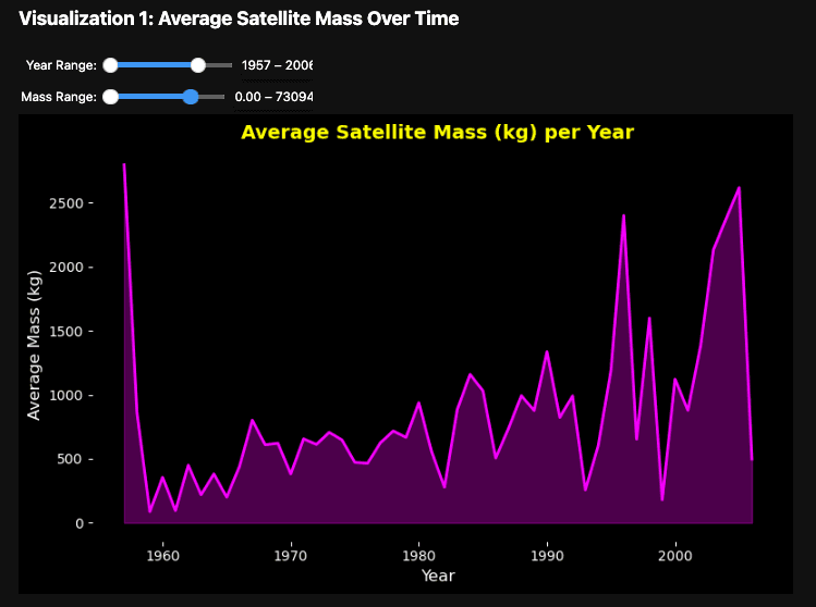
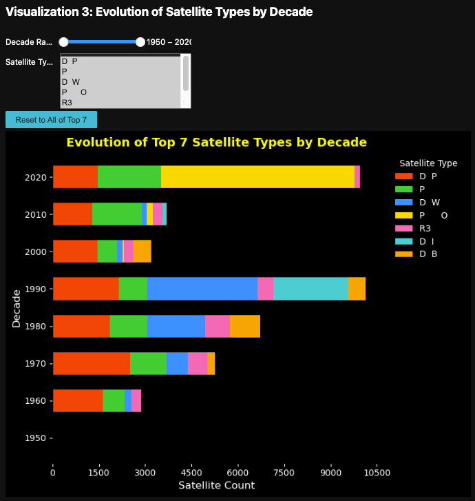
The workflow used Python, Pandas, NumPy, Matplotlib, and Jupyter Notebook to clean the records, process trend-oriented features, build interactive dashboard views, and assemble a final infographic poster for presentation.
Interface Screens
Architecture View
Engineering Decisions
- Clean and process the satellite records before charting so mass, orbit, and type comparisons are based on consistent fields.
- Use filterable dashboard views to explore average satellite mass over time and satellite type changes by decade.
- Combine exploratory dashboard outputs with a single infographic poster that communicates the main story in one visual artifact.
Technical Challenges
- Reducing a large multi-decade dataset into readable visuals without losing important trend changes.
- Balancing quantitative detail with poster-level storytelling and visual hierarchy.
- Making dashboard screenshots and the final poster usable together in a compact case-study format.
Outcome and Current Status
Completed data storytelling project with cleaned satellite records, interactive dashboard views, trend analysis, and a final infographic poster explaining major developments in the satellite age.
Lessons and Next Steps
- Publish the dashboard if a public deployment is prepared.
- Document the data-cleaning assumptions alongside the visual outputs.
- Add more views for orbit distribution and mission-category comparisons if the analysis is extended.